Now that we have finished the last three briefs and have some spare time whilst the assessments are going on, we have been given another brief until we go back to having our normal contact sessions. This brief is called 'Influence Boards'. What we have to do is to choose six categories, these could be anything to do with art and design or with any other interests. We then have to make a montage of pictures for each category digitally to which should be the size of an A4 sheet of paper An example we have been given is a creative media student interested in music may choose films, music composers, actors/actresses, directors, animators and artists as their categories.
"By doing this exercise, you may discover that there is far more behind the image than you imagined. Apart from the obvious descriptive information that other people can identify with, there may also be personal stories relating to the reasons for the choices you make. These are stories that uniquely relate to you as an individual and form the person you are and your identity."
I found that pretty interesting and quite inspiring and so I got my notebook out and started coming up with possible categories that I could do. They were 1. Animators 2. Animation Styles 3. Motion Graphics? 4. Visual FX 5.Films 6. Adverts 7.Architecture 8.Pattern 9. Illustration 10.Texture
In the end I decided on Animation Styles, Films, Adverts, Architecture, Pattern and Texture. Although when researching images for texture I decided that I would call the category 'Colour and Texture' because not on was I concentrating on finding textures when researching but I was paying a lot of attention to the colours and whether I had a nice balance of the different colours.
Here they are...
Adverts

I chose to do adverts as I love them... I understand that not many people would say this as most people find them annoying, but I do! There are some rather annoying adverts out there and some pretty dull ones but also a lot of interesting fun ones and very visually exciting ones! These adverts don't have to be animated to catch my eye, although most of them are. Whenever I see a new advert that intrigues me I love trying to guess how it was made and then research it! One thing I love about adverts is that they are all very different, there's never one the same or similar (that I have noticed), they all use different techniques, styles etc and are pretty imaginative! One day I would love to be a part of one of the creative teams that create adverts
Films

I chose to create an influence board of films. I was very aware that the subject of 'films' was a very wide one and that I needed to narrow it down, so I decided to do it on films from throughout my life that have wowed me. After I chose these films I realised that the majority had been altered/made with the use of computers! These are the films that have been the greatest influence in my life and I feel that it is my parents that I have to thank for this, they have engrained computer generated imagery into my mind from a very early age!
Animation Styles

I'm quite an enthusiastic person when it comes to styles of animations and so I thought I'd get together a influence board of animation styles that I have previously come across and loved. Most of these are from my last two visits to Bradford Animation Festival. One is of the 'Deathly Hallows' animation in one of the Harry Potter films and the green one in the bottom left hand corner is a animation made by Lotte Reiniger, which was used as inspiration for The Deathly Hallows. It seems that I like silhouettes, interesting lines, shapes, textures etc. I'm not too keen on the style that Pixar use, it's ok for what it is and does its job but I feel that they have used it so many times that it's not anything special anymore. This is a shame as I have been shown quite a few times just how much time, effort, work and skill is put into them. This is not to say I don't like Pixar and their films because I do, they have made some brilliant ones with excellent stories that are very entertaining. I guess I just like more 'arty' styles!
Pattern

I chose patterns because I love them, particularly geometric patterns. I love the different illusions and dimensions they create. I like how you take a simple single line and create something quite complex and visually exciting. Each line or shape in these patterns have order to them, there is nothing random about them and it's easy to know how it will carry on. This appeals to me and the way I think, when I have a project I like to know the order in which I need to do something and I like to think that nothing I do is random, but instead well thought out.
Colour and Texture
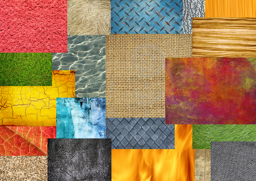
I chose colour and texture for my fifth influence board as like pattern, I love them and I feel they play a very important part in all things visual. I also pay a lot of attention to both of these when creating a piece of work. I love to use these two elements to compliment each other being careful to balance them well. Texture and colour can give dimension and depth, I find flatly rendered images very boring. I feel that I should mention that pattern also kind of comes into this category. Throughout Secondary school (High school to those Americanised) I was lucky to have the same art teacher for the majority of my time there, a very good art teacher too. And so from the start of year seven all the way to the last year of my a levels I had seven words drummed into my head, these words were colour, tone, shape, pattern, line, texture and composition. These words are now very important to my practice as a design students and it comes naturally for me to think about them when creating something.
Architecture

And finally, architecture! After seeing my last two boards and then seeing this one, I suppose it isn't much of a shock that I have decided to have architecture as one of my categories. As you can see, there is line...lots of line, shape, pattern, textures...not much colour but there is tone and composition! I didn't choose architecture just because of those elements, architecture also intrigues me through it's 3D-ness and structure! There are loads of interestingly shaped buildings all over the world with some very clever engineering. I love seeing the possibilities that 3D shapes can give you and various environments that can created with them.
Overall from doing this exercise I have found out that there are some people that have influenced my influences, these people are playing and have played a very important part of my life. I have also found out that I love to be surrounded in variety, that visuals are very important to me, I like to be in control and know exactly what I'm doing and why I'm doing it and what needs to be done next, and the seven words... colour, tone, shape, pattern, line, texture and composition play a big part in my creative practise. From looking at the animation style montages I have also decided that I like graphic styled animations too. This has left me feeling quite obsessed with everything visual!