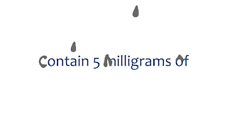
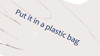
I had some feedback from my tutor and she suggested a couple of things, especially to do with the type. The first thing she said was to think about using a dark blue or green instead of black for some of the text as black can be a killing colour. And in some frames like the light bulb frames the black could get confused with some of the black bits on the light bulbs making it harder to read. She also said about not having a capital letter on all of the words but instead just the very first word on each line as a capital letter on every word look unnatural. Which makes perfect sense, and I have no idea why I put capitals at the beginning of every word either!
So that is what I have done! I started out by testing different coloured texts and decided to use dark blue instead of black for most of it and then a dark brown for the text on the door. Here are my two storyboards..
Storyboard One
Storyboard Two
These changes are only subtle when you think about it but they make such a difference! I feel that just from this the storyboard feels much better. My tutor also said about playing with alternative solutions for different frames, for example the mercury in the second storyboard, it could drip away rather than just disappear up out of frame. This is something I'm going to do next.


No comments:
Post a Comment