This is my creative futures two page containing all work that I have done for this module.
Influence Boards
For this brief I had to choose six categories, these could be anything to do with art and design or with any other interests. I then had to make a montage of pictures for each category digitally to which should be the size of an A4 sheet of paper. An example that was given was a creative media student interested in music may choose films, music composers, actors/actresses,directors,animators and artists as their categories.
"By doing this exercise, you may discover that there is far more behind the image than you imagined. Apart from the obvious descriptive information that other people can identify with, there may also be personal storied relating to the reasons for the choices you make. These are stories that uniquely relate to you as an individual and form the person you are and your identity."
I found that quote from the brief pretty interesting an quite inspiring and so I got my notebook out and started coming up with possible categories that I could do. They were 1.Animators 2.Animation Styles 3.Motion Graphics? 4.Visual FX 5.Films 6.Adverts 7.Architecture 8.Pattern 9.Illustration 10.Texture
In the end I decided on Animation Styles, Films, Adverts, Architecture, Pattern and Texture. Although when researching images texture I decided that I would call the category 'texture and colour' because not only was I concentrating on finding textures but was also paying a lot of attention on the colours and whether I had a balance of the all the different colours.
Here they are..
Adverts

I chose to do adverts as I love them...I understand that not many people would say this as most people find them annoying, but I do! There are some rather annoying adverts out there and some pretty dull ones but also a lot of interesting fun ones and very visually exciting ones! These adverts don't have to be animated to catch my eye, although most of them are. Whenever I see a new advert that intrigues me I love trying to guess how it was made and then research it! One thing I love about adverts is that they are all very different, there's never one the same or similar (that I have noticed), they all use different techniques, styles etc and are pretty imaginative! One day I would love to be a part of one of the creative teams that create adverts.
Films

I was very aware that the subject of 'films' was a very wide one and that I needed to narrow it down, so I decided to do it on films from throughout my life that have wowed me. After I chose these films I realised that the majority had been altered/made with the use of computers! These are the films that have been the greatest influence in my life and I feel that it is my parents that I have to thank for this, they have engrained computer generated imagery into my mind from a very early age!
Animation Styles

I'm quite an enthusiastic person when it comes to styles of animation and soi thought I'd get together an influence board of animation styles that I have previously come across and loved. Most of these are from my last two visits to Bradford Animation Festival. One is of the 'Deathly Hallows' animation in one of the Harry Potter films and the green one in the bottom left hand corner is an animation made by Lotte Reiniger, which was used as inspiration for the Deathly hallows. It seems that I like silhouettes, interesting lines,shapes, textures etc.I'm not too keen on the style that Pixar use, its ok for what it is and does its job but I feel that they have used it so many times that it's not anything special anymore. This is a shame as I have been shown quite a few times just how much time,effort, work and skill is put into them. This is not to say I don't like Pixar and their films because I do, they have made some brilliant ones with excellent storied that are very entertaining. I guess I just like more 'arty'styles!
Pattern

I chose patterns because I love them, particularly geometric patterns. I love the different illusions and dimensions they create.I like how you take a simple single line and create something quite complex and visually exciting. Each line or shape in these patterns have order to then, there is nothing random about them and it's easy to know how it will carry on. This appeals tome and the way I think, when I have a project I like to know the order in which I need to do something and I like to think that nothing I do is random, but instead well thought out.
Colour and Texture

I chose colour and texture for my fifth influence board as like pattern, I love them and I feel they play a very important part in all things visual. I also pay a lot of attention to both of these when creating a piece of work. I love to use these two elements to compliment each other being careful to balance them well. Texture and colour can give dimension and depth, I find flatly rendered images very boring. I feel that I should mention that pattern also kind of comes into this category. Throughout Secondary School (High School to those Americanised) I was lucky to have the same art teacher for the majority of my time there, a very good art teacher too. And so from the start of year seven all the way to the last year of my a levels I had seven words drummed into my head, these words were colour, tone, pattern, shape, line, texture and composition.These words are now very important to my practice as a design student and it comes naturally for me to think about them when creating something.
Architecture

And finally, architecture! After seeing my last two boards and then seeing this one,I suppose it isn't much of a shock that I have decided to have architecture as one of my categories. As you can see, there is line...lots of line, shape, pattern, textures...not much colour but there is tone and composition! I didn't choose architecture just because of those elements, architecture also intrigues me through it's 3D-ness and structure! There are loads of interestingly shaped buildings all over the world with some very clever engineering. I love seeing the possibilities that 3D shapes can give you and various environments that can be created with them.
Overall from doing this exercise I have found out that there some people that have influenced my influences, these people are playing and have played a very important part of my life. I have also found out that I love to be surrounded in variety, that visuals are very important to me, I like to be in control and know what exactly I'm doing and why I'm doing it and what needs to be done next, the seven words...colour, tone, shape,pattern, line, texture and composition play a big part in my creative practise.From looking at the animation style montages I have also decided that I graphic styled animations too. This has left me feeling quite obsessed with everything visual!
Personal Project: Text Animation
Someone quite close to me had her birthday coming up and so I made it an opportunity to try and animate some text to send her a birthday message. I had wanted to try this for a while, especially after the Design for Society brief. So I recorded my voice in many different ways and started to animate, this is the final video..
Not only did I have fun doing the voice but really enjoyed this exercise. It's not too polished or complicated but I feel that there is a lot of room for me to improve and become more imaginative. Maybe if I used some really interesting long words with more expression and meaning than 'happy birthday' I may have more inspiration to work with. I'm really happy that I made this. Not only is it on my blog but also on vimeo so anyone browsing my videos will see a little more diversity.
Bradford Animation Festival
Wednesday 9th November 2011

Professional One

The Monster of Nix
Dir. Rosto / Netherlands / 2011 / 30 minutes / Style:3D
"Life is good in the idyllic fairytale village of Nix... until an
all-devouring monster appears. Young Willy has to fight it. Alone."
I have to
say, I didn't understand this story, it left me feeling really confused
and frustrated, and so therefore I didn't enjoy it at all! There was a lot that was happening, almost too much for me to take in. This was a
very bad start to the festival! The style was ok, not my most favourite
but it was different. I first thought that the main character - the boy
was actually a girl just from the clothes and hair but then I realised
that it was a boy when he was called by his name - Willy. On a positive
note, I did like the effect of the mirrored boxes and the eggs, I
thought they looked amazing and were really effective!
Brandt Rhapsodie
Dirs. Francois Avril, Morrigane Boyer, Thibaud Clergue, Paolo Didier,
Ren-Hsein, Tristan Menard, Lucas Morandi, William Ohanessian, Lucas
Veber / France / 2011 / 5 minutes 34 Seconds / Style: 2D
"The ordinary tragedy of a romantic encounter, sung by Benjamin Biolay and Jeanne Cherhal."
I quite
enjoyed this animation, mainly because of the rhythm it had to it - it
has a really nice flow. I loved the idea of animating to a song, a song
in which had a story to it. So not only did it have this rhythm and flow
but also a story, one that I am sure that many can relate to. the only
down side to this was that the subtitles were a little distracting to
the animation but that couldn't be helped, you needed to know what they
were saying to know what was going on. The style was very simple and
quite grown up, which straight away suggests that its aimed at adults,
which makes sense with the story it is telling.
A Morning Stroll
Dir. Grant Orchard / UK / 2011 / 6 minutes 47 seconds / Style: 2D, 3D
"When a New Yorker walks past a chicken on his morning stroll, we're left to wonder which one is the real city slicker."
This film
was brilliant! It had three different styles, each representing three
different times; one set in the 1950's - the style for that was black
and white with simple drawn lines, one in 2009 which was very colourful,
blocky and used flat shapes, and the other was 2059 - in the future
where the world was post apocalyptic, the style for this was 3D but
wasn't as bright as 2009, it was quite grey! In the 1950's scene the
chicken walked past the man and the man reacted as if it was very odd,
in 2009 the chicken walked past the man again and this time the man
decided to film the chicken but got distracted by a game, by the time
he'd finished the chicken had gone, and then finally in 2059 the chicken
walked past the man...but the man was no longer a man but rather a
zombie and instead of the man stopping and staring at the chicken like
the previous men as if it was odd, the chicken stopped and stared at the
zombie, which lead to a rather funny chase! It was a good story, it had
me gripped, made me laugh and at one point even made me jump! Not
surprisingly, this film won two awards at BAF this year!
Plume
Dir. Barry Purves / France / 2011 / 14 minutes 40 seconds / Style: Stop Motion
"A winged man, a fall, a hostile encounter, a life changed forever."
This was
another film that I became confused and frustrated with, I didn't quite
understand what was going on. It was only when I saw it the second time
in Barry Purves talk and he explained what it was about that I
understood it! Basically it is a winged man - not an angel, that likes
to fly (flying and wings represent freedom) but he falls to the ground
and gets savaged by these demon creatures (who have little tiny black
wings- Barry said that the idea of this was that if the winged man gave
up this would be what he would turn into). The man picked himself up,
pulls off the remaining part of his wings and finds some water, he ends
up underwater swimming - or 'flying' underwater as if he has found his
freedom again. The style of this animation was very simple, there was no
backgrounds or scenes, just blackness with one main character (the
winged man) and the three demons and some really effective lighting.
This suited the story perfectly and was beautifully animated. The end
bit where the man is underwater was done by using CG, which you could
tell because the man wasn't as stiff as before when the puppet was being
used. Other than the transition between stop motion and CG seemed
pretty seamless!
Captain Hu
Dir. Basil Vogt / Switzerland / 2011 / 9 minutes / Style: Drawing on film
"After a violent storm Captain Hu is stranded with his ship in the Alps.
A helpful farmer finds new uses for the deep-sea equipment. However,
Captain Hu draws the line at the end."
This film
was very cleverly thought out and I quite enjoyed -it wasn't my
favourite though. When watching it I found myself sympathising with the
captain, every time he would give the farmer some thing and then found
out he needed it I found myself saying 'Oh No!!' in my head, and then
when he finally was able to make his exit in the end I was cheering (in
my head again)! So in that sense I felt the film was good because I was
able to get involved with it in my own way! The style of the animation
was very simple...just white lines on a green background which
emphasized the barrenness of where he was stranded with his ship stuck
upside down on the mountain and the loneliness he was probably feeling,
especially as no one would help him turn his ship the right way up!.
The Girl and The Hunter (La Fille & Le Chasseur)
Dir. Jadwiga Kowalska / Switzerland / 2010 / 5 minutes / Style: 2D
"It's raining. A small village is in big trouble. the raindrops are
actually a young girls tears. And it's up to the hunter to put things in
order...
I liked
this story, it was well thought out. I like the way it builds up, from
the a couple of drop coming down and the villagers gathering around to
see where its coming from (the girl) to the village starting to flood
and the villagers working to shift to another location, then the other
location run out of space for more water and so it over fills and starts
flooding the village. The village floods so much that the villagers end
up on the roofs like the girl, then they all start crying! Which
speeds the flooding process up, the hunter puts his gun to the girl but
ends up comforting her, she then stops crying but the villagers
continue, finally the hunter gets them to stop when they see that the
girl has stopped. The village starts to drain but it ends when rain
starts to pour down! This film had good timing and was quite humorous, I
enjoyed watching it. The style is quite dark which reflects the sadness
of the girl.
Student One

366 Days (366 Tage)
Dir. Johannes Schiehsl / Germany / 2011 / Style: 3D
"Starting his social work as a paramedic, young Patrick soon comes in
contact with patients that are all suffering from the same problem:
loneliness. As he tries to help, he gets himself into relationships that
are way more demanding than expected."
This
animation touched my heart, the use of emotion through expression and
body language was really effective, it had me feeling really sad for the
patients the man was trying to help more. It started out very slow and
sad as he found out that the patients were lonely, then it picked up a
bit when he started helping, but when he found that he couldn't do it
all and had to let the patients down it went all slow and sad again.
Finally through the help of his colleague he found a way of helping more
but in a way that wasn't too demanding and that was by listening to a
certain song and keeping to the rhythm of it. From then the story picked
up again and finished happy. The animation had a very simple colour
palette, mainly red, white and greys which put the story across very
effectively. I really enjoyed it.
The Golden Bird
Dir. Cat Bruce / UK / 2011 / Style: Stop Motion (Puppets) , Cut Outs
"When a boy goes in pursuit of a mysterious golden bird, he is lead
further than he expects and discovers that in his world, things are not
what they seem."
This
animation was a bit of an odd one for me. I didn't like it but I didn't
dislike it. My thoughts were like this with everything, for example the
style was creative but I didn't find the story very exciting, it didn't have much entertainment value.
The Bridge Chronicles (Chroniques du Pont)
Dir. Hefang Wei / France / 2010 / Style: 3D
"Qiao-Yu, a volunteer worker, keeps watch over a bridge on the Yandtze river in China, a notorious suicide spot."
This
animation had a feeling of mysteriousness to it, probably because of the
mistiness. Again like in 'Captain Hu' this film had me saying 'Oh no!'
in my head. The style was simple with a simple muted colour
palette..actually quite a drab colour palette! But that suits the story
perfectly as it's quite a sad story.
Damned
Dir. Richard Phelan / UK / 2011 / Style: 2D
"An over ambitious beaver goes too far when he gets the chance to realise his ultimate dream. Some dreams are just too big."
The story
to this animation was brilliant! it's something everyone can enjoy,
young and old! It starts off with a beaver building his dam, but as soon
as he finishes it it gets ruined by all sorts of creatures. There's a
postcard of the Hoover Dam which is quite clearly shown that it would be
his dream to build a dam the same. Finally, he gets the help of some of
the other animals help to him build this dam. It turns out that the dam
is a bad idea for everything the other side and so the beaver end up
having to destroy it in order to help and save the other animals. This
was a very funny story and was effectively told by the use of body
language and expressions. The style was simple and cartoony which
emphasized the humour and fun
Abuelas (Grandmothers)
Dir. Afarin Eghbal / Uk / 2011 / Style: Stop Motion, Cut Outs, Pixilation, After Effects Manipulated Imagery
"In a small department in Buenos Aires, an old woman eagerly awaits the
birth of her grandchild and all the joys of becoming a grandmother.
However, horrific circumstances mean she will be forced to wait over 30
years."
This was a
very touching film, quite sad in the middle but happy in the end when
the grandmother finally got to meet her grandchild. This animation had
so many different techniques of animation in you would have thought it
would have been too much but it wasn't! It was done well and
effectively. With the pixilation technique the animator never showed the
whole person and then everything else was integrated around that. I
enjoyed watching this as it was quite visually interesting and it had a
nice story and message behind it.
The Visit (Der Besuch)
Dir. Conrad Tambour / Germany / 2010 / Style: 3D
"A tragicomical story about an old woman, who, to the horror of her son,
is cooking up a meal in the middle of the night for her long deceased
friends. But as soon as her son has gone, the guests actually show up.
Fantasy, dream or reality? What is the difference? When people get
old..."
I enjoyed
this animation, I wanted to say 'Oh bless her!'. Although when the son
and the mother were talking about the guests she was expecting I didn't
realise the people they were talking about were dead! I personally
thought the son was very mean! The style of the animation was very much
like Pixar films, which I would think suggests an audience of all ages!
This was a lovely story, especially as the old lady's guests did turn up
in the end.
Growing Space
Dir. Kate Broadhurst / UK / 2011 / Style: 2D Drawn, Paint on Glass
"An animated documentary about adults suffering from mental health
problems and the transformational healing process that comes from
gardening and a community spirit."
I felt
that I should be feeling something from this animation and it's story,
but I didn't. It had people who are suffering from mental health
problems talking about how gardening and the community spirit really
helps them. Maybe I didn't really connect to this as I don't really
understand or know anything about mental health problems. The style was
very different to most animations I have seen, it was done like an
illustrated gardening book with text like 'figure one' attached to
certain objects. You can see that the animator used paint on glass as
the brush strokes are quite prominent! I found this style very creative
and visually pleasing.
El Macho
Dir. Daniela Negrin Ochoa / UK / 2011 / Style: Drawn on Paper / Silkscreen Print Background
"Carlos yearns for order and calm amidst the chaos of his loud family of
women. The arrival of Alfonso, an energetic poodle puppy, shatters any
dreams he had of peace and quiet. Soon it's even too much for the women.
Something has to be done...."
I wasn't
too fond of this animation, the style didn't do anything for me but it
did go with the Mexican theme well. This story made be quite bored at
the start, it didn't really capture my attention but it got better
towards the end. This was basically I story about a man who lives with a
house full of women, who go out and get a dog of which is male. The man
initially isn't very happy about it but gradually the women get annoyed
with the dog but the man begins to like it and in the end has quite a
strong relationship with it.
Swimming Pool
Dir. Alexandra Hetmerova / Czech Republic / 2010 / Style: 2D
"A night love story of two outsiders, who meet in closed swimming pool in the middle of a big city.
I loved
this story! I especially loved the twist in the end. It wasn't like any
other animation I've seen or any other story I've read. I liked the
style too, very simple but quite complex at the same time.I liked the
build up, the whole swimming routine between the man and the lady in the
pool, this was very effective, only ever seeing their top halves and
then the ending where the man in charge of the pool catches them and
tells them to get out. But when they get out he sees that they are only
half human and so runs away where they are left to spend more time with
each other in the pool.
Panorama Three
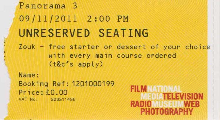
Remembering Formby
Dir. Sue Elliot / UK / 2011
"A brief introduction to Formby Patterson-Wright: The safest man who ever lived."
To be
honest, I don't remember this one very much which I believe says it all!
But on researching it I remembered what it was like. This animation was
quite graphic with the use of various signs. It was quite visually
interesting but in the way of animation it didn't do anything for me.
On the Rails(Sur Les Rails)
Dir. Jeremy Guiter / France / 2011
"An old man sees his life pass in which he made a decisive choice for the rest of his life."
The main
story of this was that a young photographer in love left his partner to
go to war to document it by photographs. He became famous for a really
good photo but in the mean time lost his partner. It then shows him a
few years later and sad, remembering the lady he loved. This was quite a
sad animation but very touching. I enjoyed watching it. The style was
ok but I didn't find it to be anything special. The colour palette
certainly reflected and emphasized the mood of the film and reflected
how the man was feeling.
Late One Night
Dir. Anna Prager, Asaf Shub / Israel / 2010
"One night in Kishinev, Ivan, a clumsy but good natured burglar, enters
Auntie Tania's meagre apartment. She is napping in the drawing room and
awakes without Ivan noticing - quietly stealing behind his back to the
kitchen to prepare a surprise for the luckless burglar."
I enjoyed
watching this, I felt that it was a good story/ idea! When the burglar
broke into the house and the old lady got up, I was waiting for her to
come up behind him to and knock him out with something! But of course
she doesn't, she makes him something to eat which I found very sweet! I
also found this a little said, as when the burglar looks around the
house looking for possessions to steal there were none! The poor old
lady had nothing..except one piece of jewellery hidden behind a picture,
which he finds but gives it back! I wasn't too keen on the style of
this animation. It was stop motion and a little messy for me, I prefer
the 'Wallace and Gromit' style stop motion where there are clean lines
and a smoothness to it.
Small Gamers
Dir. Bruno Collet / France / 2010
"Take part in the latest adventure of the Summer Olympics! But remember to duck, because ours fly close to the ground."
This was
quite a fun little stop motion animation using various toys and objects.
I thought this was quite a good idea, however some bits went on a bit
too long for me. I wouldn't mind using the same technique one day, by
using ordinary objects to create an interesting animation.
The Man Who Was Afraid Of Falling
Dir. Joseph Wallace / UK / 2011
"Ivor's life is turned upside down after a falling plant pot sparks a bizarre series of paranoid reactions."
This was a
lovely stop motion animation of a man who was afraid of falling. It was
a very sweet story and I thoroughly enjoyed it! I loved the mixture of
3D stop motion puppet and paper thought bubbles, I felt it make it very
visually interesting!
To my excitement Joseph Wallace has mentioned myself and my blog on his blog about this film he made, referring to what I have written about it!
www.themanwhowasafraidoffalling.com/2011/12/afraid-of-falling-got-nice-mention-on.htm
One Second Per Day
Dir. Richard Negre / France / 2011
"One second of film, meaning 25 drawings per day during one year, thats the goal."
This
animation had an interesting effect through movement of shapes and lines
and was very visually exciting to watch...that is up until a minute or
two, then it just got boring and samey! I know that the idea behind it
was to do 25 drawings a day but I don't understand the reason behind the
lines and shapes. By the end of this film I was very frustrated, mainly
because I wanted it to end!
Bertie Crisp
Dir. Francesca Adams / UK / 2011
"Bertie Crisp, a half bear, half panda lives in a caravan park with his
sociopathic bunny rabbit wife, Grace. She is determined to have a baby-
the problem is she wants on immediately, and with Bertie struggling with
the... traditional method, they turn to plan B - Kidnap!"
I didn't
like this story, I'm pretty sure I was frowning all the way through it. I
didn't like the style either, I don't think that helped, neither did I
pick up that Bertie was half panda either! I can safely say that I won't
be watching this film again!
Out on a Limb
Dir. Falk Schuster / Germany / 2011
"Leaves are falling all around, colder winds are arriving and birds are
gathering together in preparation for the journey south. Though autumn
is at an end and winter is imminent, one bird refuses to accept that
change is happening."
I LOVED
the style and technique used to make this animation! It's so different
to other animations that even if you don't quite get the story it's
still very interesting to watch! The technique they used was smudge and
click. Some part they drew on and rubbed of as they went, other parts
they stuck new bits of paper on top of the old drawing and drew the new
image on. I would love to try this out too. They used a very limited
colour palette, mainly black and white which I felt emphasized the
bleakness and coldness of the coming winter. I also enjoyed the story!
C4
Dir. Lera Mishurova / Israel / 2010
"In a desolate bar, a barman and waitress play "Battleship". But in
another reality, the progress of the game has a fateful result."
I didn't
like this animation either, I really didn't enjoy it! I found the story
frustrating as it kept repeating and to be honest it took me a while to
work out what was going on, I didn't like the characters I found them
quite harsh and wasn't too fond of the style either!
The Gentlemans Guide to Villainy
Dir. Aidan McAteer / Israel / 2010
"A brief guide to being bad!"
This was
brilliant. It was done in the style of an old black and white silent
public information film, maybe from the 50's. It had a good strong story
and idea behind it with an added humour and a twist at the end! I
thoroughly enjoyed this animation.
Maska
Dirs. Quay Brothers / Poland / 2010
"Maska is the latest animated film by the Quay brothers, directors and
puppet animators, with the music composed by Krzysztof Penderecki.
Beautiful Duenna was created in order to carry out a certain mission.
However, she will be forced to choose between accomplishing the task she
was created for and love."
I can't
remember this one very much, but I do remember not liking this one
either. I looked it up on the internet to see if iIcould find a video of
it but had no luck. Unfortunately this means that I have nothing to say
about it.
Music Videos and Commercials

Music Videos
Wax Tailor Featuring Charlie Winston "I Own You"
Dir. Romain Chassaing / France / 2010
"A city in miniature invaded by texts, by commercials, by advertising,
by Charlie Winston, the superstar. In the TV, in the telephone, in the
PC, he is everywhere... 'I Own You'."
This music
video had a mixture of live action film and animation. I didn't find
this video very interesting to watch. I didn't grasp the link between
the visuals and the lyrics in the song and so didn't understand why they
made the video like that with that content. However there's plenty to
look at and watch and some of the animation in the video it quite
visually effective. The technique of animation used it stop motion.
Monsieur William
Dir. Patricia Stroud / France / 2010
"Monsieur William is a perfect employee, but ignores the world outside
his office. Which is the greater evil, to contribute to the corporate
institution corruption or to live by the street's laws? Monsieur William
offers us a singular vision of the world, and raises questions about
the conventional notions of morality, crime and good and evil with
humour and sarcasm."
I found
this to be quite an average animation, the style and colour palette was
pretty grey and overall quite boring. The only thing that perked it up
was the man singing the song. It had a bit of a shocking ending and I
didn't really understand the story or what was going on.
The Waterwalk
Dir. Johannes Ridder / France / 2010
"A man goes on his way along the beach. His walk is center of a joyful
choreography., accompanied by the music of the Violent Femmes."
WARNING:
This is possibly the most disturbing music video ever seen, or at least
so by my eyes! I didn't like this at all, it disturbed me and went on
far too long for my liking. I didn't like the style either, it wasn't
very aesthetically pleasing. A little advice, avoid this music video as
much as possible!
Caffeine
Dirs. Danae Diaz, Patricia Luna / Germany / 2011
"Caffeine represents a visual metaphor for Brandt Brauer Frick's music:
As acoustic sounds are put together electronically, hand drawn images
are animated by traditional and computer media. in a mechanical world of
men, a mass of identical people start their day with coffee. At a
certain point of a typical working day, one of them wants to break from
his routine."
This was
my favourite music video out of all of them. This video pretty much sums
up how I think of London business people! I love how it builds up and
up and up and then that one person tries to break away from it. It also
goes very well with the music and sums up the title of the song. The
style is very simple with simple colours, of which are main greys but
reflects the story and people in it very well.
Little Miss Little
Dir. Marie Bloch-Laine / Canada / 2010
"Little Miss Little is wandering through her own cardboard and paper
universe. She seeks comfort in familiar objects and environment
surrounding her, but the subjective landscape of her mind starts to
crumble, urging her to come back to reality and civilisation."
I loved
the style of this music video, it was very visually interesting and I
found the technique effective, was a shame about the music! The
technique and style made it quite refreshing from the rest of the films.
I didn't understand the story until I read the description in the BAF
programme though, so that was it's downfall!
Miss Daisy Cutter
Dir. Laen Sanches / Netherlands / 2010
"Miss Daisy cutter is an animated short film by Laen Sanches featuring
'Nux Vomica' by The Veils. If Walt Disney took some bad acid this is
what his trip would look like. Don't say you weren't warned."
I didn't
like this music video, it all seemed too random to me and all over the
place. It won the best music video award, which I have to say I really
don't agree!
Gorillaz on Melancholy Hill
Dirs. Jamie Hewlett, Peter Candeland / UK / 2010
"On Melancholy Hill is the second video from the Gorillaz' Plastic beach
album. In a continuation of the story which begins with Stylo, we
follow members of the band and some of their musical collaborators on a
dramatic ocean based journey in their quest to reach Plastic Beach."
This music video is pretty much a typical Gorillaz music video! Good a always and a nice style!
Commercials
a.maize
Dirs. Roman Kaelin, Falko Paeper, Florian Wittmann / Germany / 2011
"Popped maize is mostly eaten with salt, sugar or other flavours, typically in the cinema."
This
animation was explosive!...Literally! I really enjoyed the effects in
this film. Basically it was of big pieces of maize burst and popping
into popcorn in ordinary places like parks in front of people. Obviously
the technique used was CGI and looked really life like - as life like
as a massive piece of popcorn can be!
Compare the Market - Streets of Ambitiousness
Dir. Darren Walsh / UK / 2010
"This latest installment in the Compare the Market campaign gives us
another amusing glimpse of the history of Compare the Meerkat from
Alexandr Orlov. He explains how his father set up his business on the
streets of Moscow and slowly built it up to what it is today."
I was quit
shocked to see this at Bradford, I had seen it so many times on the
telly previous to it I nervous imagined it would be in a festival! I've
always been a fan of these CGI adverts, mainly because of the great
characters. I mean, the style isn't exactly anything extraordinary, but
what makes these adverts so good is the content.
The Girl Effect
Dir. Mighty Nice / UK / 2011
"In a beautiful new film commissioned by the Nike foundation through
agency Wieden Kennedy and produced by Nexus Productions, director Might
Nice takes us on the journey of a 12 year-old girl to escape poverty,
exploitation and the risk of AIDS/HIV, to build a better future for
herself and future generations. The Girl Effect is the potential of 600
million adolescent girls to end poverty for themselves and the world."
This was a
very powerful commercial, it made me have a lump in my throat by the
end. If you haven't seen this then you should. The style of the
animation was very simple with a limited colour palette and was very
graphic-y! There was no narration or voice over but you was left to read
the information, the word of which were presented very visually and
clearly. This film was also made powerful through the soundtrack, which
emphasized the different moods on certain bits and made you feel the
words with more emotion. I loved this animation and has given me
inspiration for one of my projects I am doing at the moment.
The Last Journey (Die Letzte Reise)
Dir. Patrick Altmaier / Germany / 2011
"It's evening. Pale moonlight falls through the leaf canopy. A small old
man strides along the path. He starts to search for something with his
staff in the nearby bushes. Suddenly small creatures whiz out of the
bushes and follow the old man. We arrive at the bottom of a giant temple
and climb up to the peak while the spirits of the forest follow us. As
we reach the top the shaman grabs on of the luminous balls of his staff
and throws it into a bowl. A play of colours emerges and the strange
creatures transform into animals of the forest, running around the old
man and ascending into the night sky.
I didn't
quite understand what was happening but it did look very pretty with the
luminous balls! There's something about CGI that animators seem to do
the same sort of style nearly all the time. Which was the same as this
film, it was quite an average style CGI film and as I didn't really
understand what was going on I didn't really think much of it!
The Siege (Coke)
Dirs. FX & Mat / UK / 2011
"Nexus directors Fx & Mat teamed up with top VFX house Framestore to
create cinematic story of the clash of two cultures. Set in an icy
fantasy world, the spot sees and army of fearsome fire warriors poised
to descend upon a peaceful community of ice-dwelling creatures.
Accompanying the warriors is a huge fire-breathing dragon, which leaves a
burning path of destruction in it's wake and little doubt as to the
outcome for the defenceless villagers. The spot originally aired on
Sunday 6h February to around 85 million people and the Superbowl XLV."
This was
brilliant, it felt so grand that at the beginning and in the middle I
thought it was more like a clip out of a feature film, and then
obviously the ending gave it away. The story kept me gripped and
interested and I loved the ending! The style was CGI and really suited
it!
Hermit (Einsiedler)
Dirs. Elliot Deshusses, Christian Hertwig / Germany / 2011
"An old hermit fulfils his dream of his own 'Home Cinema'. Even if a whole mountain has to be blown away."
This was a
brilliant idea, I loved it! To start with I didn't know what it was
going to be about but it all made sense in the end (after the build up)!
I felt that the right technique was used (CGI) to get the brilliant
effect of the mountain being blown up. I really enjoyed this film, it
was exciting to watch.
Green Design Festival 2010
Dir. NOMIT / Germany / 2010
"Promo video for the Green Design Festival, organised by Brainlab not
for profit agency, under the aegis of Municipality of Athens and the
Ministry of Environment, Energy and Climate Change. The concept
underlying the video is that green development produces green effect,
not colour. Green development is not green. It's pink, yellow, blue..."
This film
was very simple, very graphic-y and had a very limited colour palette! I
didn't feel that there was much to it but it was fresh and design-y,
which is good because it was a short film for a design festival!
This Unpredictable Life
Dirs. Smith and Foulkes / UK / 2011
"'This Unpredictable Life' is a breathtaking mix of volumetric lighting
and magical particles bringing to life a beautiful fantasy world through
which we take an amazing trip. Cleverly playing out the central premise
of the ad, that life is an unknowable journey, the film combines
simplicity and sophistication with an uncomplicated but engaging central
character starkly contrasted against a series of deliciously complex
and abstract backgrounds. Set to a cinematic poem, we follow our hero as
he swoops and wheels through lifes journey."
This is a
person floating around going on life journey, the unpredictable journey
of life. It's a pretty simple way of showing this but very effective.
CGI was used to create this animation and I felt that it worked well and
suited the message that it was trying to give.
Planters Holiday Party
Dir Mark Gustafson / USA / 2010
"Mr. Peanut appears in an innovative series of stop motion animation
commercials, animation directed by Mark Gustafson, that peek into his
multi-dimensional world, where people can experience his life., his
humour and his friends as never before. The first commercial follows Mr
Peanut's annual holiday party, giving the first glimpse into his
personality and the things he cares about."
This wasn't my favourite film but was still good, it just didn't do anything for me. It certainly didn't sell me the product!
Manege Magique
Dir. Viola Baier / Germany / 2011
"In the backstage area of circus 'Manege Magique', a little
absent-minded conductor accidentally mixes up his baton with the magic
wand of the circus' magician. Unaware of his mistake he inadvertently
turns the whole circus into a magical underwater world."
The style
of this animation was ok, nothing 'magical', just your average 2D
animation style. The story was quite interesting, I would have thought
that it's more aimed at children as it's a pretty simple idea.
Specsavers Happy
Dir. Darren Walsh / UK / 2010
"'Happy' is the latest commercial in a campaign by leading optician
brand Specsavers and uses characters from the well loved BBC children's
series Mr Men. the new 2D animation spot features Mr Happy, My Greedy,
Mr Messy, Mr Bump and Mr Tickle."
Using the
Mr Men to advertise is a very clever idea, especially as it's
advertising for a wide range of people as a wide range of people are
very familiar with the Mr Men!
Cartoon Network ID Bumpers - Riverdance & Cartoon Network ID Bumpers - Country
Dir. Alexey Alexeev / Hungary / 2010
"Animated sequence for Cartoon Network."
These were
two very funny and very short animated films. The style is very much
what I would describe as cartoon networks style...from what I remember
from when I was younger! Very cartoony and very fun!
The Chase
Dirs. Smith &Foulkes / UK / 2011
"Smith & Foulkes have created a dynamic new spot for Venables and
Bell and Intels incredible new core i5 processor - a breakneck, all
action chase scene which is the perfect showcase for the new processors
amazing capacity. Using a dynamic mix of live action and animation,
Smith & Foulkes used every trick in the action movie book and got
some hot insider tips from their DOP, Oliver Wood, of Bourne Trilogy
fame, to create this thrilling spot. The result is a fantastically
clever illustration of the Intel processor working at maximum capacity
and showing just that the Core i5 can do.
This was
very clever and I have no idea how they did it! It was very different
and very unique way of doing an animation. This is a very interesting
film to watch and I can imagine that it does it's job with capturing the
audiences attention to sell the Core i5 to them.
Professional Two

Out of Erasers (Sudd)
Dir. Erik Rosenlund / Sweden / 2011
"As the world transforms, you're the last one to find out."
This was a
clever film and was more like a feature film! It used live action and
animation. I loved the story, it was very unique and creative and had me
capture. it was filmed in black and white which worked very well,
especially with the scribbles riding up people and people completely
covered in scribbles. I really enjoyed this film and would watch it
again!
The Lost Town of Switez
Dir. Kamil Polak / Poland , France, Canada, Switzerland, Denmark / 2010
"An accidental traveller, drawn by mysterious forces, discovers the
secret of a ghostly town which lies at the bottom of a forgotten lake."
This. Was. The. Most. Beautiful. Animation. Ever!
This animation was an oil painting masterpiece that moves! It was the most visually exciting animation that I have every seen! The story wasn't as amazing but the visuals more than made up for it! I would love to see this again, it was truly magical.
This animation was an oil painting masterpiece that moves! It was the most visually exciting animation that I have every seen! The story wasn't as amazing but the visuals more than made up for it! I would love to see this again, it was truly magical.
Nullarbor
Dirs. Alister Lockhart, Patrick Sarell / Australia / 2011
"An animated road movie set across the vast and barren landscape of Australia's Nullarbor Plain."
This is a
CGI film, of which the style is pretty average. I felt that the film
isn't so much about being arty, creative and unusual but more about the
story and the humour. The story kept building up throughout and had
continuous humour all the way through it, but the best bit was the end
(not because it ended) because it had a brilliant twist that no one
expected to happen!
The Maker
Dir Christopher Kezelos / Australia / 2011
"A strange creature races against time to make the most important and beautiful creation of his life."
This film
was made using stop motion puppets! It was beautifully and sensitively
made and I really enjoyed watching it. The story had me gripped as we
watched the puppet try to make a new puppet - a lady puppet before the
time runs out! I liked the style too, this was a nicely made stop motion
film.
Tchaikovsky - An Elegy
Dir. Barry Purves / UK / 2011
"Alone in a locked room, the Russian composer Tchaikovsky is forced to evaluate his life and works."
This was a
beautiful film by Barry Purves. I much preferred this one to 'Plume'.
Barry used the Stop Motion technique and a little CGI. He only had one
puppet of which was Tchaikovsky and one set, all of which was very
simple but very effective. There was a good use of emotion and
expression mainly through the body language of the character. I really
enjoyed this film and it was also very educational, I now know all about
Tchaikovsky and his life! Well done Barry.
Ray Harryhausen: Special Effects Titan
 |
| Image from the BAF 2011 programme |

Documentary
France / UK 2011 - 95', Directed by Gilles Penso, Produced by Tony Dalton.
"Ray Harryhausen's work is unique in movie history. Author, co-producer,
co-director, co-editor, sculpture, animator and special effect
supervisor of most of his films, Harryhausen used to do by himself
what's being done nowadays by dozens of artists. Incidentally, he
embodies the transition between the old generation of visual effects and
the new one. According to his own words, Harryhausen represents a
connecting link between King Kong and Star Wars.
Supported by the Ray and Diana Harryhausen Foundation, with an unlimited
access to the personal archives of the artists, including his most
famous puppets and armatures, this documentary retells ray's whole
career, from his garage days in the United States to the creation of
Medusa and Pegasus in the original Clash of the Titans. But more than a
simple portrait, Special Effects Titan endeavours to reveal the creative
chain that has been driving fantasy cinema from the early days of
George Melies to the latest Hollywood blockbusters."
This was a
very interesting documentary. It linked famous, more current films like
Star Wars and Jurassic Park to some of Ray Harryhausen's films and how
his films have influenced many films with certain creatures and how they
move etc, even with the like's of James Cameron's Avatar. This was very
insightful and just proved that Ray Harryhausen is a massive part of
the animated film history and has had a massive influence on many films.
He not only did the roles of an animator but also a model maker,
director, producer etc! He is an inspiration to many and can't be given
enough credit.
Thursday 10th November 2011
Student Two

The Box (Die Kiste)
Dir. Kyra Buschor / Switzerland / 2010
"Three frogs have a discussion about the contents of a mysterious box."
This film
didn't do anything for me, in fact it bored and frustrated me! And then
the end wasn't even worth waiting for. CGI was used to create this
animation, the style went well with the mood of what was happening but
thats about all of it's good points.
The Renter
Dir. Jason Carpenter / USA / 2011
"A young boy is dropped off at an elderly woman's home for the day. A
lone man adds to the unsettling atmosphere. The savage slaughter of a
chicken makes this daycare a harsh and confusing world for the boy, who
learns caring can be shown in unexpected ways."
I wasn't
too keen on this animation, it was certainly unsettling but I didn't
really get what the boy character was feeling about the man and how we
as an audience was meant to feel about the man. The description also
threw me as I didn't feel quite like it was talking about the same film
that I was watching. I certainly didn't feel that the boy learnt that
caring can be shown in unexpected ways. this just didn't work for me.
Discarded (Hors-jeu)
Dir. Elodie D'Ambrosio / France / 2011
"Following a printing error, a 53rd figure, without symbol or value, slipped into a pack of playing cards.
I didn't
like this animation either, it was a good idea but the chase bit went on
far too long and I lost interest. When I first saw an image from the
film in the BAF programme I got quite excited as I quite liked the style
and thought that it would be a good film but I was pretty disappointed.
It just shows that something can look pretty but if the story isn't
good then there's no point.
Laszlo
Dir. Nicolas Lemee / France / 2010
"Laszlo is a man with no past who just wants to live in peace- anywhere will do."
Again,
unfortunately I didn't enjoy this one either. I just could keep up with
the story and didn't understand a lot of things. However, I loved the
style, with cut out and ripped round photos etc this made an interesting
effect and would love to try this sometime.
Strings (Lyannaj')
Dir. Guillaume Lorin / France / 2010
"After the abolition of slavery, a former female slave and a land-owner
who has lost everything are forced to learn to live side by side."
I thought
the concept and message behind this animation was good but I don't feel
that it was put across very well and was described in the BAF programme
too clearly either. This was a very short film and I feel it ended a bit
abruptly and part of the story was missing in the middle. The sytle was
ok, nothing too outstanding.
The Backwater Gospel
Dir. Bo Mathorne / Denmark / 2011
"As long as anyone can remember, the coming of the Undertaker has meant
the coming of death. Until one day the grim promise fails and tension
builds as the God fearing townsfolk of Blackwater wait for someone to
die."
I loved the style of this, it was
really different and the story was brilliant too. It keep me on the edge
on my seat, there was a lot of anticipation in it and the ending wasn't
expected either!
A Life Well Seasoned
Dir. Daniel Rieley / UK / 2011
"A man loses the most important person in his life, but as the story
unfolds we see how he overcomes his loss. Through a series of
extraordinary events, the man deals with his grief in a way that may
seem absurd to others."
This animation was made using stop
motion. The style was beautiful and it had lots of different textures,
and the story was very touching. The story of the man is told in a
sensitively lovely way.
Journey to the Sunflowers Field (Voyage au Champ de Tournesols)
Dir. Alexandre Siqueira / France / 2010
"Nicolas, a five year old boy, has an accident while playing with his kite."
I didn't full understand what was
happening in the story until I read the description in the BAF
programme, after that it made perfect sense! I wasn't so keen on the
style though.
Heldenkanzler
Dir. Benjamin Swiczinsky / Germany / 2010
"Heldenkanzler is based on the true story of Engelbert Dollfuss, who
wants to keep up with european fashions of the 1930's by enforcing his
own facist dictatorship in Austria."
I didn't like this one, I found the story very crude and the style emphasized this.
John & Betty
Dirs.Luke George, Alex Hancocks / UK / 2011
"Elderly couple John and Betty are happily married until John's
unhealthy obsession with solving crimes leads him to grow dangerously
suspicious of his wife."
This was quite a nice little story
with a bit of fatal ending! Not too sure on the style, they used stop
motion puppets but I found these quite average, it was nothing special
visually!
Arrietty (Kari-gurashi no Arietti)

Hiromasa Yonebayashi / Japan / 2010 / Voices: Mirai Shida, Ryunosuke Kamiki
"14 year-old girl Sho discovers Arrietty, a tiny 'borrower' who lives in
a tiny house beneath the floorboards and who borrows things from the
adult world. A magical adaptation of Mary Norton's children's classic
The Borrowers by Studio Ghibli, the much-loved animation studio behind
Spirited Away, Ponyo and Howl's Moving Castle."
I thoroughly enjoyed this feature
film, it had a lovely little storyline to it, both touching and fun.
The style had plenty of detail to it and went with the story really
nicely. I would definitely watch this film again given the chance.

Studio M.I.R. - Irina Margolina

Studio M.I.R. was founded in 1991 by film director Mark Lyakhovetski and script writer Irina Margolina.
"The Studio initially focused in producing documentaries, but since 2005
the Studio has been producing animated films and series, and has
recieved numerous international awards at international animation
festivals. Award winning scriptwriter, director and producer Irina
Margolina, Head of Studio M.I.R. joins us to introduce a retrospective
of their stunning films."
A number of Studio MIR's films were
screened including 'Tales of the Old Piano: Beethoven', 'Tales of the
Old Piano: Rossini', 'Tales of the Old Piano: Prokofiev', 'Contemporary
Fairytales of the World: Three Little Pigs', 'Contemporary Fairytales of
the World: Art' and 'Contemporary Fairytales of the World: La Si
Do-Sharp'. These are made for the purpose of being educational for
children, I felt that the Tales of the Old Piano ones were slightly old
for children and felt that they would easily be bored from the very
start. The Tales of the Old Piano animations would not just be boring to
children because of the content but because they are also very dreary
and the colour palette is very dull, something that you would least
expect a child to watch! Another thing that bothered me was that
although all three were made for the same 'series' they all had
different styles because each one had someone make them. This may just
be me but I found this very strange, it gave no continuity.
The Contemporary Fairytales were a
definite improvement as far as its targeted audience is concerned! I
thought that The Three Little Pigs story was very creative and expressed
a brilliant message - that you should find out both sides of a story
before coming to any conclusions. Art was also very good, but I wasn't
so keen on La Si Do-Sharp.
Richard MacGuire in Conversation with Paul Gravett

"Richard McGuire designed and directed the animated film 'Micro Loup',
which is the first part of omnibus feature film, 'Loulou et autres
Loups' (Loulou and other Wolves, 2003). He also created the closing film
of another omnibus feature, 'Peurs du Noir' (Fears of the Dark, 2007).
He is a regular art contributor to the New Yorker Magazine. He has
written and illustrated both children's books and experimental comics.
his comics have appeared in Art Spiegelman's RAW magazine, The New York
Times, McSweeney's, Le Monde, and Liberation. And he is the founder and
bass player of the punk-funk band Liquid Liquid. He is currently working
on a graphic novel expanding his comic entitled 'HERE'."
This man has many skills and talent
- animator, illustrator, graphic novelist and musician! His animations,
and work in general have a very graphic style. My favourite piece was
'Fears of the Dark', I felt that style was thought out really well to
suit the story and the mood and was animated really well. You couldn't
see every object because of the style and the lighting but you still
felt their presence. It was just a brilliant piece.
My second favourite was 'Mirco
Loup', this had a very simple style to it but was very effective and
visually exciting. This had also been thought out very cleverly and the
story was brilliant! If you haven't watch either of these then do! In
fact I'm going to link a video to make it even easier for you..
'Peurs du Noir' (Fears of the Dark)
'Micro Loup'
This man has definitely been an
inspiration to me and proves that the more skills you have and the more
you can do the more work you will have. It's also lesson on how
collaboration with other designers is good. This was a great end to the
day.
Friday 11th November 2011
The Animated Century

Dir. Irina Margolina & Adam Snyder
"An entertaining and comprehensive look at the history of animation
worldwide. Animated characters, the Professor and Horace demonstrate
different animation techniques, including pin screen, pixilation,
rotoscope, and cutout and puppet animation. They discuss the most
significant animated films of the past 110 years - everything from Emile
Reynaud and Windsor McCay's early works, to Fleischer, Disney and
Warner Brothers in the United States, to historically important films
from every continent.
I didn't see the last 30 minutes of
this as we slipped out to go and see the next one (which was well worth
it). It wasn't a brilliant documentary, the 'host' characters used to
explain things got on my nerves and the animations shown wasn't
brilliant and very well known either, some very crude. It was quite
interesting when they went through the history of animation, what
techniques used to be used and what's used now etc! I would say that it
would be a good thing for young animators or beginners that are thinking
of taking up animation as introduction
.
Mainframe

"Mainframe is a high-end animation and visual effects studio which is
home to some of Europes top directors, producers, animators and vfx
artists all working closely to produce a plethora of groundbreaking and
visually stunning work."
This talk was brilliant, they did
the vfx in Cher Lloyds music video 'Swagger Jagger' and showed us the
processes and how they did it. The only negative to this was that he
made us listen to the whole of her song at the end. But that nothing
compared to what he had to go through when making it!
Andy Schmidt - Pixar


"Andrew L. Schmidt is a senior animator with Pixar Animation Studios.He
has worked in the animation industry for twenty seven years and has a
long list of credits in both traditional 2D animation and CG animated
films.
He began his career in 1990 in London, UK at Amblimation Studios where he worked on Fievel Goes West, We're Back and Balto.
In 1996, Schmidt relocated to loas Angeles, California where he worked
for Dreamworks Feature Animation on the Prince of Egypt, then moved to
Warner Brothers Feature Animation where he animated on the Iron Giant
and Osmosis Jones.
Since he joined Pixar in 2000, he has animated some of the most
recognised Pixar characters to date: Mike and Sully in Monsters Inc,
Marlin Dory and Bruce in Finding Nemo and Bob and Helen in the
Incredibles. He has also animated on Ratatouille, Wall-e, Up, toy Story
3, Cars 2 and various Pixar short films including supervising animation
on Partly Cloudy.
Schmidt is currently creative director of promotional material for the
upcoming Disney Pixar feature film Brave, scheduled for release on 22
June 2012."
Last year we had Paul Mendoza from
Pixar do a talk at BAF which was brilliant and so I was automatically
excited when I found out that there was another guy from Pixar coming
again this year! And he didn't fail to please! He spoke about, again,
the processes that are undertaken to create the films, the different
teams involved and how he got to work at Pixar (who knew that you didn't
need to already know how to animate on the computer with programmes
like Maya to get a job there!)
It Lives! It Lives - The Re-animation of Frankenstein's Cat

"The development of a successful cartoon series, from book to script to
screen with Curtis Jobling and later development to show running with
Alan Gilbey."
This one was good too, it gave a
bit of variety, especially as it was bout a children's series and how
Alan Gibley was employed to reinvent it. I found it interesting as the
two gentlemen took us through the whole story, from the beginning when
Curtis Jobling was on a train to an important meeting and doodled the
main character all the way to the end where it was screened on TV. And
what a journey they went on to get there! It made me realise that in
order to make a children's series possible you need to keep it loose
enough with some good interesting characters that have a lot of opposite
characteristics and strong clear relationships with each other (not
always good relationships) to be able to come up with tons of stories
for lots of different programmes, otherwise you have no chance of
getting your series on the screen.
Barry Purves: Frame by Frame, Note by Note


"Stop motion animator Barry Purves has won over sixty major
international awards, including Grand Prix, Best Director, Best Film,
and OSCAR and BAFTA nominations. Barry's films are known for their
innovation, passion, elegance, lush visuals and fresh interpretations.
In addition Barry has directed and animated some 70 commercials, title sequences and animation inserts for films and pop promos"
One word to describe this man is
passionate! He spoke about two of his most recent films - Tchaikovsky
and Plume, Tchaikovsky being my favourite! His films are beautiful,
stunning and a piece of art. Tchaikovsky was one of Studio MIR's Tales
of the Old Pianos programmes, and was a massive improvement compared to
the others that I saw. It was beautifully made and worth seeing if you
haven't already. Plume wasn't so good, I didn't understand it the first
time I saw it. Unlike Tchaikovsky, Plume had no background and consisted
of mainly the four characters and feathers!

Saturday 12th November 2011
Lifetime Achievement Award: Geoff Dunbar

"Illustrator and author Geoff Dunbar received the BAF Lifetime Achievement Award."
We were given a retrospective of Geoff's award winning work, with a short documentary giving an insight into his career.
I really enjoyed the documentary, I
found it very interesting and informative. I had no idea who Geoff
Dunbar was until I attended this and I'm glad I did. He is a very
inspirational man.
Beyond Anime: CALF Animation

"The new CALF label aims to redifine our notions of what we understand
by the terms "Japanese animation" by giving a stage to some of the
country's most innovative and exciting practitioners in the field. This
programme showcases the works of four such talents, balancing the
hypnotic, hand drawn visual symphonics of Mirai Mizue and the dazzling
light shows of the TOCHKA collective with the more orthodox let no less
idiosyncratic line drawing animations of Atusushi Wada and the unique
photo collages of Kei Oyama, including the unforgettable Hand Soap,
which has won prizes at a number of festivals including the Yokohama
International Festival for Arts and Media and the Oberhausen
International Short Film Festival in Oberhausen."
I didn't enjoy this screening at
all, and neither did the two people sitting next to me - they were
asleep! The films shown were called "In a Pigs Eye", "JAM",
"Consultation Room", "PiKA PiKA 2007", "Usual Sunday", "The Mechanism of
Spring", "MODERN", PiKA PiKA @ Reel Asian Film Festival", "TOCHKA",
"Day of Nose", "Gentle Whistle, Bird and Stone", "METROPOLIS", "PiKA
PiKA @ Media Seven" and "HAND SOAP". There were a variety of animations
using different techniques. The ones that I enjoyed more were the "PiKA
PiKA" films, these were animations made but using long exposure whilst
people made shapes and images with lights at night. I thought it was
quite clever, different and visually very interesting. You can tell that
they had fun making them too. Personally I would prefer watching Anime
any day compared to most of these films!

The Art and Evolution of Animation Layout

"Legendary animation layout artists Roy Naisbitt ("The Thief and the
Cobbler", "Who Framed Roger Rabbit") and Scott Caple ("The Incredibles",
"Mulan") join author and industry veteran, Fraser MacLean for a unique
presentation to mark the publication by Chronicle Books of "Setting the
Scene: The Art and Evolution of Animation Layout"."
I loved this talk, I found it very
interesting as I had never heard of the 'layout artist' before! We were
shown some of the tricks and subtleties in the background/layout that as
an audience would never see but makes all the difference. We were shown
the opening of Pinocchio and were asked to count how many different
layers of background there were...I lost count! And then were asked why
we think the step on the front door was rounded, which was to do with
the movement of characters in the scene. I was amazed with how much the
layout was thought about so that the animators could get the most out of
whatever is happening in the scene. I will certainly think more about
this when creating animations in the future. As for Roy Naisbitt's work
in "Who Framed Roger Rabbit" in the Kitchen scene where Roger Rabbit is
flying about, that is just amazing and I would love to know how he did
it! We were shown the scene of it flat so we could see what he had to
work with to create it, it was hard to work out which bit was what! The
last thing we were shown was a film called "The Last Belle"...
The Last Belle
Dir. Neil Boyle / UK / 2011
"The Last Belle is an aimated short featuring two characters journeying
towards a blind date: WALLY, who suffers a nightmarishly drunken trip
through London as he races against the clock to rendezvous: and ROSIE,
who waits in a bar dreaming of how wonderful her date is going to be...
if he ever shows up."
This was very funny and I
thoroughly enjoyed it! Roy Naisbitts part where Wally is drunk and
making his way through the underground is very effective and brilliant!
This worked very well gave the effect of Wally been drunk and off his
head very well. I felt very sorry for Rosie but also didn't want Wally
to shown up as he wasn't as she was dreaming and I was very glad that
she ended up with the barman. The ending of the film was excellent and
it had very good execution throughout!
Creative Futures Week
Monday
Talk One: Opening Address
For this talk we were meant to have Maurice Cockrill however they were unable to come and so had the University's Vice Chancellor, Professor Michael Scott instead. A little bit of Prof Michael Scott's background would be that he has written many books mainly on Shakespeare. He was a Visiting Professor of English at Georgetown University, Washington DC for fourteen years, and he has spent 30 years in the higher education sector.
This talk included the history of Shakespeare ( a very quick one), he spoke about how Shakespeare kept going even when business was bad and how he used the creative industry to make money and how Shakespeare was a good business man. He concluded the talk by saying that even though Shakespeare had many crisis's he kept going, he then said that everyone will have a crisis sometime in their career and that we should use that crisis to bring something good and positive from it.
I felt that his talk had a good message to it and is definitely something to remember for the future.
Talk Two: Key Note Speaker, Angus Montgomery - Editor of Design Week.
Angus Montgomery described himself as a journalist, he didn't really tell us much about his background but he did give us some useful knowledge and gave us some good advice. The first thing he did was gave us some quotes from people who practice in the creative industry. (Excuse me for misspelling of names as spellings weren't shown), the first of whom was Simon Manchip whose quote basically gave advice to graduates to promote both yourself and your work, promoting yourself is just as important as promoting your work. Rhiannon James from D&AD's quote was about marketing yourself professionally and that design is a business. Greg Quinton's quote said that graduates should take themselves away from the internet so that they don't get the same influences as everyone else, he also said that collaborating is good and creates a culture of great ideas, and finally to love what you do and have passion, passion will get you far. He also asked these people and some other people whether they would pay £9000 or more to go to uni and do the courses they did all over again, of which none of them said no. They all said that £9000 is worth paying and that they wouldn't even question not going to uni. What was really nice was that throughout the talk Angus kept saying how working with people from the creative industry is brilliant because they are all exciting and inspiring, and that the creative industry is unique and special.
He showed us some examples where design has made a difference to certain campaigns and has made some pretty interesting stuff. Such as The Body Shops campaign to stop sex trafficking, the design for this made an unpleasant situation positive and engaging. Because of this, law changes were made in 17 countries because of the branding of the campaign.
 |
| Body Shops Trafficking Campaign |
Another campaign was 'One laptop per child', previously laptops that had been used and no longer wanted/needed from the western world was shipped over to developing countries for schools to use, however a designer said why not make the children their own laptops that are created for their specific needs and so thats what they did. The laptops created cost just over 100 dollar each and 2.5 million of them were shipped out over 4 years. Thanks to design it was made possible for children in developing countries to own their own laptop.
 |
| Children with their own laptops |
My favourite design that he showed was of 'designer energy saving light bulbs'. Low energy light bulbs are the ugliest light bulbs ever and people hate them but feel obliged to use them because they are 'green', and so one designer said that the light bulbs had a good concept and energy saving but why can't they look nice, and so he went on to design some low energy light bulbs that looked much better. I would say that I love the look of them but I can't imagine anyone wanting to use them for their chandelier!
 |
| Designer energy saving light bulbs |
Another example where design was used to improve something was the A&E experience in hospitals. There have been many cases where there have been violence against staff leading to many having time off due to stress and so the company Pearson Lloyd (http://www.pearsonlloyd.com/) wanted to make the A&E experience calmer and safer. They created a mapping system where patients can follow a flow diagram to know what is happening and what will happen next, rather than feel like they have been waiting around for ages and nothing is being done. This will also tell them how busy A&E is.
 |
| Pearson Lloyds Flow Diagram Design |
This was pretty inspirational, showing us how design can make a difference and can make a massive impact if used correctly!
Talk Three: Building an Audience, Making a Living from Comics, John Allison.
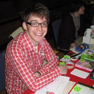 |
| John Allison |
John Allison graduated from university in 1997 and gained a degree in Journalism. He didn't manage to get a job straight away and so to make himself look busy he started to draw comics. He posted these on the internet where he got an audience of approximately 1000 people. In 1999 he got a job in a magazine.He carried on with his comics and in 2001 he started to use Adobe Illustrator to churn them out, his audience had now grown to 4000/5000 people. In 2002 he started to create comics where he was no longer posting on the internet for people to read for free, as a result of this his audience went back down to being 1000 readers. 2003 he became redundant and so made a book collection, his audience went up to 15000 people. 2004 he stayed at home and created many more comic strips, 2005 he started to focus more on composition and in 2006 John started to experiment. By posting his comics on the internet he was able to gain a bigger audience even though he wasn't getting much money from it. 2007 he stopped doing his comics digitally and started using fine liner again, 2008 he started to use Manga studio and started to refine his work and in 2009 he created the comic 'Scary go Round' which he didn't enjoy but at this point his audience had now reached about 55000 people! In 2010 he started to create work that he could possibly sell to publishers, 2011 he did more refining but also made things simpler and now in 2012 he is now in the process of signing for a book.
 |
| 'Scary Go Round' |
Advice he gave is not to be shy, an example of this is a comic artist he knows of and he said that this guys comic strip is the worst ever comic strip created but at conventions, because this artist put himself out there and has confidence, he sells all of his books.
He also said to get in contact with other people that is doing work like ourselves and talk to people at conventions to get contacts.
More advice he gave was to make money in all the ways you can that also gets your brand out there, for example make t-shirts, tea towels, coasters etc and sell them, become a business baron, get things as cheap as possible and study successful people.
This man was great to have to give a talk, he gave lots of useful advise (even though he's in the comics industry and I'm animator) and was a joy to listen to. It's amazing how hard he kept pushing himself and kept going even when there was no work for him and because he's been consistent with his fans and readers throughout he has now got a great amount of followers.
Talk Four: A Freelance Career in Animation and Illustration, Karen Cheung
www.karencheung.co.uk
Karen Cheung first studied Zoology in Cambridge University but discovered that she preferred drawing specimens and got more praise for her drawings than she did for her written essays, and so when she finished her degree she went and did a foundation course in Chelsea, followed by an Illustration course at University in Bristol. Her first animation was called 'Heartbreak Hotel', of which she showed and I really liked it! She entered BBC New Animator competition with it and was short listed, her animation was shown all over the world but she didn't win. Next she illustrated a childrens book and entered the MacMillan Prize for childrens picture book, of which she won! She then made another animation called 'Welcome to the Zoo' which she also showed us, it had bags of personality and really well made.
 |
| Welcome to the Zoo |
She had her degree show in London in a little gallery space. This is where she met her agent, they were situated next to the gallery. Karen's animation tutor told her not to sit around and wait for work to turn up at her door but instead to go out to various studios and show her work. From this she got work with 12 foot 6 who asked her to do some character designs and eventually asked her to work with them to create some animations. Here she made animations for Paramount Comedy, Virgin Central, Virgin Media and Bookstart. She stayed there for 2 and a bit years and eventually went freelance. This is where she found out just how brutal the industry could be, one example os that herself and her agent went and pitched one of their ideas to a client and the client liked it, however they rang her up later on to say that they had given it to someone else. Karen told us that to work in this industry you need to be able to take rejection and be hard skinned and to keep going. Since being freelance Karen has done work for companies such as Skoda, Honda, Smart Car, Fiat, Dorling Kindersley, Ikea, Tesco, ITV, Asda, Proder and Gamble, Vodaphone, Umbro and Oxford University.
To be in this industry she told us that we need to be versatile, flexible and take on things that come your way even if it's not to out particular style.
I loved this talk, it showed us what can be done if you are determined, work hard and are passionate about what you are doing. It also showed us that you need to get yourself out there and search for opportunities and not just wait for something to happen! This was goo too because it's the sort of animation work that I've been quite interested in for a while now and so it was nice to know about this particular part instead of things like children's programmes and films etc.I came away very inspired.
Tuesday
Talk One: After Your Degree: The First Steps (Games), Dave Boydel
Dave studied digital art for games at my University (Glyndwr) and graduated last year (2011). Before this he studied fine art and graphic design. At University he did things like digital sculpting, 3D modelling, synopsis writing (world creation) and game engines. He said that he would say that he is mainly a concept artist and likes doing character design, environment design, prop design and 3D modelling. At the moment he is working at Dreadnought creating a game for facebook.
He gave good amounts of advice such as..
After graduating you should keep practicing your art, don't give yourself time off because it's likely that you won't get back into it, so keep sketchbooks, do digital art, explore new media's and technologies, set yourself goals and don't slack off.
'Prick up your ears'- do networking,, make business cards, open a deviant art account (deviant art is a non professional way to show your portfolio online and communicate with other artists), join in with forums, have your own blog and go to conventions such as MCM, Thought Bubble and Regional Shows.
When applying to studios be professional, make your CV maximum of one and a half pages, in your cover letter sell yourself and don't waffle, be flexible and go where the work is, be prepared to make coffee and expect not to be what you want to be at the beginning.
Dave had to move to just north of London to get his job.
He ended on this quote..
"Choose a job you love, and you will never have to work a day on your life."
-Confusious
This was a good talk, it was nice to have someone that recently graduated from our university and see that they have been successful in gaining a job. He was also able to give some really good advise, I will definitely be taking this all onboard.
Talk Two: Character Design and Social Networking, Jonathon Edwards
Jonathon Edwards is an illustrator and does animation design.
In 2007 Jonathon designed a character called Inspector Cumulus from a couple of doodles. A friend then made a CG model of the character to give him an idea of how it would look if it was a toy. Eventually after a couple of adjustments he had the character made into a toy that sold in various places all over the world.
He then made some more characters that were monsters, of which another friend who had studied dress making said that she could make them in the form of plushies and so thats what they did!
One day Jonathon was watching 1982 general elections and sketching away in his sketchbook characters inspired by the politicians and what they were wearing. His friend Louise then said that she would like to make them but bigger than any normal plushie and with lots of detail. And so thats what she did. They made loads of them. They got quite a few people following them on Twitter. One day Louise did a tweet saying that she would love to make one of one of the fashion ladies on This Morning (I can't remember her name), this lady saw this tweet and became very interested. She then asked them both to create some for her window in London Fashion Week. They were in the window for 2 weeks.
During this two weeks someone from Selfridges had seen the window and so they contacted Jonathon and Louise and asked if they would do a window for them for the following christmas.The theme was a dolls house. Their display was in the window for 2 months.
 |
| Part of Selfridges window design |
Jonathon gets inspiration for his characters from everyday people.
They then went to Japan for 5 weeks to do a project on headspace. Whilst they were there they were asked to do some work for a design on a milk vending machine in Stockholm. For this Jonathon drew the characters and Louise made the characters of which was then stages and had a photoshoot for the final image.
 |
| Milk Vending Machine Design |
This was an interesting talk, it definitely had a different perspective what could be done with character design. However I didn't feel that I got anything from it in the way of learning more about character design of which I was hoping. I hoped that it would give me advice and tips on character design as I'm not too confident with it but there wasn't anything like that.
Talk Three: Illustration and Key Graphics: Work, Realities and Copyright. David Newell
The start of David's career started off to be 'awkward', he was clever and artistic and so to start with chose to do Science but his heart wasn't in it. So he went to art college, as soon as he finished he got a job in science. However he ended up going back to art ans was determined to make a future from it. To make money whilst doing his own work he did sign writing. He then got a job in a newpapers and then in an agency all doing creative work. He then got into commercial work doing work for companies such as AEI, Linnoff March, Super Target, Racing Technik and Party Flyers. in 1996/97 he started doing work for agencies, however when some work came his way he gave an offer to the company which was to go straight through him, that way they wouldn't be paying so much and he would be paid more. They took him up and gave him a job afterwards. He did work for BASF, United Friendly, Tron Bonne (playstation one game) and Doctor Party.
In 2002/03 he did artwork for The Clothes Show Live, after this he went on to creating and designing packaging for a number of products such as toys for the discovery store, Supacell Digital batteries, Unity Comdoms and Flurodine toothpaste.
 |
| David Newell Supacell Design |
It was nice to see how his career developed and to see the variety of work and jobs that he has done. Again, it was nice to see as all of his work has been commercial and that's the sort of direction that I would love to go with animation.
Overall today wasn't too bad, I have to say that best one was the first talk and the worst was the last. But I gained more knowledge and now know things that I didn't know yesterday!
Wednesday
Talk One: Ffresh, Berwyn Rowlands

Ffresh is a student moving image festival held in various places in Wales every year. This event was established in 2002 and was designed to showcase student films (live action and animation) from the UK and internationally to help students put themselves out into the creative industry. Berwyn told us that the creative industry is ravenous but also lazy and that the people that win awards at the festival are more likely to get work even if there are some other films that are just as good. He also said that it's surprising as to how many people that are in this industry of moving image watch little television - I can imagine they don't really have much time for it! He encouraged us that we should go to as many festivals as possible to know what other students work is like and to know where we stand.
He announced to us that Ffresh is coming to our university next year, 13-15 February 2013! It couldn't have come at a better time for me as I'll be in my last year and will give me the opportunity to help out with the event, doing either ushering, trailers, ads, posters or design work. Not only that but if I get to do ushering I'll have access to the 'green room' where all of the speakers and VIP's will be and would be able to get up close and personal with them.
He also encouraged us to not only get our work that we do at uni out on the web etc but to also show our personal work, this would show people in the industry just how passionate we are and would build up our portfolio.
I would definitely like to take part with the festival, I think this would be a great experience, I may also submit my own animation. It's open to submissions approximately from mid summer to the end of summer, so when I've finished uni I could use the summer to create a film to submit.
After this talk I feel that I definitely need to do more personal work in my own personal time, although it's easier to say than do! I'm definitely going to have to look at how I organise my time and try to shuffle things about to try and create some extra time for this.
Talk Two: Putting a Portfolio Together, Jason Minsky
Jason Minsky studied jewellry at Glyndwr University (Was NEWI) and then went on to Manchester to study 3D design where he designed things like furniture and sculptural pieces. After graduating he worked in a studio for a bit and then went on to do an MA in Ceramics and Glass. Advice he gave us for our portfolio was to represent our work in the way that's best for showing our designs and ideas, and to put our work in a certain order maybe so that it tells a story, this will keep whoever looks at it interested. To invest in professional and smart ways to present our work and a good way to present our work if you make films is either on a showreel or on vimeo/youtube.
 |
| One of Jason's pieces |
I didn't get a great deal out of this talk, it wasn't what it was described as either, in the description said that he would be telling us how to put our portfolio together and to give us advice, which he didn't really. All he spoke about was work he had done and ideas that he's come up with within his career. This was disappointing as I felt that it was going to be a really useful talk, especially as I'm thinking of applying for work experience etc for the summer, possibly in some animation studios. I got quite excited when he said that he had a showreel and that he would give some tips on the best ways for you to make them but he never did!
Talk Three: Working as a Freelance Animator, Ian Whittle
After Ian Whittle graduated from doing his MA he went to the Midlands to pitch an idea to to an Animator Residency Scheme but unfortunately didn't get it! He then managed to get a job at Second Home Studios in Birmingham where he helped to make stop motion adverts and films. They make animations for companies such as CITV, BBC, Diet Coke and Pilsner. He then got a job at The Red Door Animation Studios which is where he is still working. They are a lower budget animation studios and get council funding. Ian does workshops with children ranged from 8 years old to 18. They use a range of animation techniques such as cut out, digital 2d, traditional drawn, and mixed media animation. He has created an animation called 'Away from Home' which is about children that have been taken into care. For this animation they used interviews that they had with the children and pictures that the children had drawn, which they then animated on Flash.
It was great to have Ian come a speak to us as he had lots of useful information to share and lots of brilliant visuals to show us, including quite a few animations that he had created. It was nice to see that he was using the more traditional take on animation rather than CG! I also got to learn some more about animation in advertising which was brilliant. This has definitely given me a lot of inspiration and was a great end to the day! Thank you Ian
Thursday
Talk One: A Career in Childrens Illustration, Helen Papworth
Helen Papworth started with do Art A level and went on to become an art teacher. Later in her life she then became a VSO volunteer in Ethiopia and eventually got a job in the Ministry of Education. When she came back to the UK she applied to Glyndwr University to study Children's Illustrations. After this she became a VSO volunteer again but in Rwanda. She finished her degree in children's illustration in 2006.
Helen started the children's illustration course because she loved books, love drawing, loved writing, she could work from home and not be stuck in an office, it was flexible, didn't have another job and had enough money to pay for the course fees. Her two main influences were/are Arthur Rackham and Saun Tan. She gave advice that if you wanted to go into illustration (and I'm pretty sure that the same goes for animation) you should do atleast one sketch a day either from life, the TV or media. She's always been scared of colour and avoids paint.
Helen's main style is to use mixed media with photoshop and her influences are african, such as the culture, landscapes, environments etc. She illustrated for children in education in Ethiopia.
Helen decided one day that her research was better than her illustrations and so started a PhD in Creative Writing where she worked with writers and artists. After this she went on to create quite a few books for her younger Ethiopian audience.
It's nice to know that someone is using their skills in another country and is successful, even though she doesn't earn much money and I love the fact that she's doing something that she loves - it was clear from the talk how enthusiastic she was about what she does. Although it doesn't really appeal to me it made me realise that there is work beyond the UK. Some of the advice she gave such as do a drawing a day was good, I think I've slacked off from my drawing and I think it definitely shows in my work.
Talk Two: Going into Business as a Young Entrepreneur, Charli Dickinson
Charlie Dickinson is part of the Launch Project which help people in rural Wrexham start their own business. They help by giving business grants of which is government funded.
The first step to making your own business is coming up with an idea, the advice she gave was to carry around a notepad so that if you get an idea whilst you're out and about you can write it down. She also said that it's useful to talk to other people about your idea to get some feedback etc.
Once you have your idea you need to do some research, who are your customers? What's your market? And is there any competition? How much money do you need to start it? Will you need a piece of property? How can you be funded? Where are your customers?...Internet, forums, online communities, market stall, shop? Do you need to travel to where your potential customers will be?
And finally marketting, this is the crucial part to having a business, it's an investment because if you have little marketting you will have a small amount of customers.
This talk was nice and simple and was easy to keep up and understand. It just made you think about things that maybe you wouldn't have otherwise if you wanted to start a business. Think this would only affect me if I was to start selling stuff like t shirts etc with my own brand on it to sell myself and my work. Which I may well do, I have been thinking about this this week. Not only should I hopefully make money from doing such a thing but it's also marketing/advertising.
Today wasn't the best day of creative futures week but I did gain extra knowledge and advice which is always handy!
London Industrial Visit
In March I went with my University to London to visit various London animation studios.
These are the studios we visited..
Studio AKA
We were given a talk about Studio AKA, what they do, the processes they go through to get work from clients and to create their animations. Studio AKA primarily create commercials. To have a commercial to create they are contacted by a company or agent and are given between 24 hours and 1 week (if lucky) to come up with an idea, create artwork and pitch it to the company. If they win it they normally have 12 weeks to create the commercial.
At the pitch they show various pieces of artwork such as concept art of characters, maybe an animatic or blockmatic and backgrounds or environments etc. They use various techniques to create commercials, they say that it all depends on the commercial as to how they go about it. However they like to throw in some stop motion every so often to freshen the team up.
There is only about 24 people that make up Studio AKA so it's a pretty small team. In between making commercials they make their own short films, such as 'Lost and Found' and their recent success 'A Morning Stroll', which they were nominated for an Oscar for and won a BAFTA! One commercial that they've kept making more of is the Lloyds TSB adverts.
I would love to work in this studio, or atleast gain some experience here as I love the work they produce, especially as they use a range of animation techniques!
Blue Zoo Productions Ltd
We started off by having a talk with Tom Box , a co-founder of Blue Zoo by showing us their show reel of which had a mixture of children's series, commercials and channel idents. He then showed us a video of the process that they went through to create the choc'n'roll commerial which was very interesting and good to see. All of their animation is produced digitally on computer. At the time there were three main projects going on which were three children's series, 'Olive the Ostrich', 'Alphablocks' and their most recent 'Tree Fu Tom' of which the staff were split up into teams, each team doing a different series. The studio was very big, spanning over two floors of which Tom Box told us that the Studio start on the lower floor and the amount of staff had more than doubled in size.
Tom Box went to Bournemouth University with the other two co-founders Oli Hyatt and Adaw Shaw and they started the company after they had graduated.
This studio was much different to Studio AKA, it was a lot bigger and there seemed to be much more going on (although this may have been to do with the time of day). We were told that to get a job there or to get some work experience within the studios you would be expected to already know how to use the likes of Maya.
Astley Baker Davies (The Elf Factory)
The Elf Factory is the studio where 'Peppa Pig' is made and more recently 'Ben and Holly's Little Kingdom'. Which makes sense to me now when I look at both styles as they are both quite similar! I liked this one, mainly because the lady that showed us around not only talked to us about the different stages that the company goes through to create a programme for a series but showed us round at the same time. So for example when she was talking about the animatic stage she took us to the team that create the animatics and got them to demonstrate how they would do it. It was good to see them demonstrating it rather than to be just shown a video as you could also ask them anything as they went along.
I liked the look of the programme they used to create the animations, its like flash but better.
I wouldn't mind getting some work experience here either!
Picasso Pictures
Again when visiting this studio we had a talk and were shown the showreel. Picasso Pictures creates commercials, title sequences, idents , TV series and short films. We were shown the stages of the making of one of their commercials called Fidelity which was about banking. Not only did I learn about how a project is thrown back and fourth to the clients to make sure that everything is to their liking and the stages used to create such a piece but also that a banking advert doesn't have to be boring and mainly fact based but can be made very visually exciting. I loved that commercial as it's the sort of thing that I would love to make. This studio was similar to Studio AKA being that it was quite small and they both create animations for commercials mainly.
Before going on the London trip I had sent my CV and showreel to a few studios in London in the hope of getting some work experience in the summer, Picasso Pictures was the only studio that got back to me, unfortunately they didn't have any free spaces for work experience until December. Having been there and seen what they do it's made me want to get back in touch in the future and hopefully I'll have more luck.
Cartoon Network Europe (Turner Animation Studio)
The last studio we visited was Cartoon Network Europe. This tour was much like The Elf Factory, they took us around the studio showing and explaining the processes they go through to create a programme for a series. They showed us an animatic they created for The Amazing World of Gumball and then each stage of creating it. It was very interesting as both 2D and 3D was used in it as well as photographs and so it was good to see how it all came together.
Overall the London trip proved to be very important and very interesting/exciting. It was good to see the possibilities for my future, especially as I have the advantage of living near London at home. I will definitely be getting in touch with these studios in the future as well as others I may come across. It was good to see how each studio worked as each one was quite different to the others.
Duke of Edinburgh Animation Project
Not too long ago I had a friend who is still in school approach me and ask whether I would help with her Duke of Edinburgh Award. For this she wanted me to teach her how to animate by creating her own short animation.
As she isn't confident in drawing we both decided that stop motion with everyday objects would be the best approach. She came up with the idea of animating shoes in a shoe cupboard. These shoes would get excited every time a person would walk near the cupboard and open the door hoping to go out...just like a dog would.
With this idea in mind she then chose three different pairs of shoes, one pair was black sparkly high heels, the second brown brogues and the last a white pair of converse. I adapted a character sheet that I've used to write up about characters that I have created to make it simpler and more appropriate for her characters. She then filled it out! ...
Character One

Full Name: Conor Martin
Nickname: Con
Age: 15
Colour/s: White but dirty
Size: 7
Nationality: British
Accent: Southern British
Physical Disabilities: None
Abilities: Video Games
Favourite Colour: Red
Greatest Fear: Mum not coming home one night
Daredevil or Cautious: Cautious
Optimist or Pessimist: Pessimist
Introvert or Extrovert: Introvert
Extremely skilled at: Video Games
Extremely unskilled at: Sports
Mannerisms: Always seems bored, tries to be the man of the house but it doesn't work.
How does the character react in a crisis: Tries to act like he doesn't careless but he actually does.
How does the character react to change: Doesn't mind...
Where does the character live: Cupboard
Where does the character want to live: Away from family
Does the character like animals: Yes
Do they like music?..What kind: Dubstep
Connor is the son of the high heels, grandson of the brogues and has no father figure in his life.
Character Two

Full Name: Edith Martin
Nickname: Edie
Age: 68
Colour/s: Brown
Size: 7
Nationality: British
Accent: Southern British
Physical Disabilities:Warn down and slow
Physical Abilities: Jigsaws and Knitting
Favourite Colour: Lavender
Greatest Fear: Family leaving her - being lonely
Daredevil or Cautious: Cautious
Optimist or Pessimist: Pessimist
Introvert or Extrovert: Introvert
Extremely skilled at: Knitting
Extremely unskilled at: Hearing
Mannerisms: Neat freak, likes to be in control.
How does the character react in a crisis: Cannot control herself because she panics too much.
How does the character react to change: Panics and becomes scared
Where does the character live: Cupboard
Where does the character want to live: Wants a bigger and cleaner cupboard
Does the character like animals: No because they are dirty
Do they like music?..What kind: 1940's Jazz/Swing
Character Three

Full Name: Laura Martin
Nickname: N/A
Age:38
Colour/s: Black Sparkly
Size: 5
Nationality: British
Accent: Southern British
Physical Disabilities: Bit off balance
Physical Abilities:Partying
Favourite Colour: Pink
Greatest Fear: Breaking a toe nail
Daredevil or Cautious: Daredevil
Optimist or Pessimist: Optimist
Introvert or Extrovert: Extrovert
Extremely skilled at: Partying - social
Extremely unskilled at: Being a Mum, not very domesticated
Mannerisms: Excited, bubbly and over the top
How does the character react in a crisis: Freaks out, is all over the place.
How does the character react to change: Likes it, gets used to it very quickly
Where does the character live: Cupboard
Where does the character want to live: Away from her Mum, finds her to be a nag
Does the character like animals: Yes
Do they like music?..What kind: Dance music.
Next came the storyboard, we knew what the idea was but we didn't know what was going to happen in the animation and what scenes and shots we were going to have.


This is the final sequence that my friend decided on. And so from all of this came the actually animation...
In the creation of this animation my roll was advising and guiding my friend with how to animate, setting up the set for the animation, lighting, rigging and as she had never animated before I helped her with the timing of the movements and how many frames to do for each shot. As we did this at my house we didn't have the more professional equipment at our disposal so I set up my digital camera on a tripod. The lighting was controlled by shutting out as much light in the room as possible and opening and closing the curtains when doing inside the the cupboard shots with the doors shut (dark) and when the cupboard doors were opened (light). The only part that I got hands on with her was when she did the shots where she was opening and closing the doors and picking up the shoes, for this I took the images and moved the eyes of the other two shoes if she asked me to do so! My friend created most of the sounds herself and a couple others I made. After this I showed her how to put together, add sound and edit the animation!
Overall I feel that this is a brilliant first animation and my friend did a brilliant job of it.
I loved working with someone that was younger and had never had a go at animation before, it was great to see her enthusiasm and to see her having such fun with it! I found this exercise very refreshing and I wouldn't pass up the opportunity if came my way again!
Animating Childrens Drawings
For a while now since BAF and more so from Creative Futures I've wanted to animate some children's drawings as a new challenge and to try something different. So whilst I was home for Easter I asked a 6 year old girl that I know if she would do a drawing of me and explained that I wanted to animate it, I also asked her to draw me something I could put in the background like the seaside or a house or a castle..it could be anything! And so she drew me as a princess, a castle and the added bonus of my cat Amber!
Now I had the drawings I decided that I would animate my character singing and wishing the girl that drew the picture happy birthday as it's her birthday at the end of the month, instead of getting her a card!
This is the process I went through to prepare for animating
This is the process I went through to prepare for animating

This is the original drawing of myself and my cat

I then made the background completely white

This is the original castle drawing

I also made the background completely white for this

I then added in bits for the background like the sky and ground

And finally myself and my cat were added into frame.
Then broke down the drawing of my self so that the arms, head, neck, torso etc were separate ready to animate. I also created different mouth shapes.
This is the final animation, I use my own voice and I did the cat noises. I found the bird sounds from a royalty free website and added in a quick title and credits.
Overall I'm very happy with the outcome of this animation, I enjoyed making it and would love to use children's drawings for another animation, maybe for a bigger project. The great thing about it is when you ask for a drawing you don't know what you're going to get to work with!
This one will also be put on vimeo.
11 Second Character Animation Competition#
I've decided to enter an animation competition I found on google. It's a competition where you're given 11 seconds of a voice recording and you have to animate a character to it. Anyone can enter and there is a new one every month. The winner gets an 'eCritique' from a professional animator from animationmentor.com
There's also a forum where you can post your work in progress and gain feedback, which is invaluable.
The voice recording for this months competition is-
"Please don't think we're ungrateful for your enthusiasm Mrs Crawley but there comes a time when things are best left to the professionals. And I really I really must go. Good day."
My first thoughts were to have 'Mrs Crawley' infront of some sort of scene where she'd tried to do something herself for the lady talking but it had gone completely wrong. Or she tried to do a job in some sort of profession.
So I looked up professions and the ones that most interested me were architects, pilots, dentist, doctor, engineer, journalist, nurses and surgeons. I thought of things like, Mrs Crawley could be stand in a pilot suit infront of a wrecked plane, or dressed as a surgeon covered in blood, architects blue prints that didn't make sense etc. I tried to imagine the other lady's role in each of these and in my mind she didn't suit many of them.
So then I looked at some possibilities that I could relate to and there were three things that came to mind. Gardening, painting and decorating, and building work, these are something I enjoy when I have spare time. The voice recording reminds me a bit of when I was younger and liked to surprise my parents by painting a room by the time they got home from work (something they may have thought about doing at the weekend), which was somewhat very messily finished due to my lack of experience. Or I thought I'd tidy the garden up a bit by 'weeding' and 'pruning' much to my Mum's horror I would pull out plants and flowers that she liked and cut bushes and roses the wrong way at the wrong time of year, again through lack of experience. I've yet to do the same with building work, I've always had my Dad's company for those!
I decided that I would base this animation on one of those experiences so that I could understand the situation a bit better. I chose to do the painting and decorating as it would be easier to demonstrate visually than the gardening one and the building one.
Mrs Crawley would think that she was doing the other lady a favour and surprise her by adding a bit of colour to one of the walls in the lady's sitting room as she had heard her talking about the possibility of having it done.
And so I created the backgrounds..

Initial sketch in sketchbook
b.jpg)
Straightening certain lines up digitally
b.jpg)
Primed the image and digitally traced the original pencil marks
.jpg)
Added the colour to show the paint job by Mrs Crawley.
I decided to only use colour for the paint to emphasize the mess made!
This is the scene that Mrs Crawley will stand in.
 |
| Bad door and door frame. |
 |
| Oversized lamp |
I drew both of these in the same scene together but the light was way too big so I made both drew them separately digitally.

This is my newly digital drawn door and door frame based on my original sketch.

And this is the redrawn table and lamp.

I then positioned them both back in one scene together with much better proportions
b.jpg)
And finally added the messy paint job. This is the scene in which the lady will be standing.
Overall I'm really happy with both of the backgrounds and the effect of paint has worked out better than I had imagined it!
These are the characters I created!..

This is my first rough sketch of Mrs Crawley, an enthusiastic newly married young lady.

This is the old Lady, uptight and proper.

And above and below are my neater digital line drawn characters, worked from the rough skteches


And both characters in the backgrounds.

I'm really happy with these characters and I feel they suit their roles well. I've loosely based Mrs Crawley on myself for reasons expressed in my previous post about this project.
And this is the final animation..
I've kept the older lady quite stiff to show that she's uptight. I'm happy with the lip sync but I think it could be slightly tighter and made more fluid if I worked at it a bit more, and I'm happy with Mrs Crawleys reaction at the end. Overall I feel that it's a good attempt.
I've enjoyed doing the 11 second competition and will be sure to do more! This one was a little rushed as I only found it half way through the time allowed for the competition so hopefully my next will be better! And hopefully I'll gain some useful feedback!
Summer Work 2011
My summer work sent to me by uni consisted of three parts-
My summer work sent to me by uni consisted of three parts-
Part One was to fill a whole sketchbook with life drawings of either people or animals in an interesting place
For Part two I had to experiment on A3 sheets with colour and media to
develop human or animal studies from my sketchbook into simplified
characters. Also had to draw the characters in a number of poses and
expressions
And finally Part Three I had to develop ideas for animated films based
on your 'real life' observations and using my characters.
Part One
I was looking forward to this part of the project as I love life
drawing. I left it for when I went on holiday in August to Rhodes, a
Greek island as I felt that this was the most interesting place that I
would be visiting this summer! These are the drawings I did..


Some didn't work out the way I would have wanted- some weren't very good
at all, sometimes I had trouble working out perspective. However I am
really happy with most of them as I feel that quite a few of them are a
lot stronger than previous drawings. I managed to capture a number of
different poses and positions as well as a variety of different people
of different sizes, shapes and ages! I really enjoyed doing this.
Part Two
This part I dreaded, I had previously done a project on character design and soon found that it wasn't my strongest point! I generally find character design quite a hard thing to do! However I had another go and this is what I came up with -
First I took my sketchbook and from that I took a few drawings of the same people and different people with similar builds and shapes and put them all together onto A3 sheets of paper.
 |
| This one is of different men with the same sort of build. I added a cape onto all of the as one of the men that I used from my sketchbook on here always wore his towel round his neck like a cape, and so I thought instead of taking it out why not make it interesting and put it on all of them. I'm happy with this as they all look like the same person. |
 |
| This is of a women that used to hang around the pool with her grand children, she had a bad back and so she hardly ever stood up. She did like to tell her grandchildren off though..her voice was very loud! When she wasn't doing that she was always reading her book. |

 |
| The first image on the top is of three different men and the bottom image is of the same man. I didn't get to know the characters of them very well as they were quite quiet and kept themselves to themselves! |

 |
| The above two images are mainly of the same girl except from two of the drawings. All of these girls used to read their books allllllllllll the time! |
 |
| This is of a little girl with blonde curly/wavy hair - she loved her ice cream! |

 |
| And finally the
above two images are of the same man, this man was very interesting. He
was mainly quiet, sitting or laying and watching the world go by. I love
the shape of his face too, I found it quite unusual. He certainly stuck
out to me! So after I did this I then chose three of them to turn them into a character for my story. I chose the little girl with blonde curly hair, the larger older lady and the man with the narrow limbs and interesting face. I did this so that I had a real variety with gender, age and size to be able to make an interesting story and for it to be aesthetically pleasing. So here are their character sheets. |


Overall I'm very happy with the outcome of these characters. I feel that
I should have done more in the way of character turnarounds and
emphasized the emotions a bit more on some of them. I rendered them with
watercolour and coloured pencils.
Part Three
Story boarding is fine when you know what story you're going to do!
Again, I don't find this bit so easy - as in making up a story. nothing
on holiday happened that gave me a lot of inspiration for a story. I
know that from looking at the characters and what they a wearing that it
would have to be set on a beach or round a pool but that's as far I
got. And so at the last minute I came up with this...


It was a pretty simple story but I felt that it was quite effective. The
storyboard wasn't rendered to the quality I would have liked to do but
unfortunately I left it far too late and so it was rushed- something I
will not be doing again.
Overall with the whole project I was very happy, if done again I would
have given myself more time to complete my work so that it would be to a
higher quality. If I had done that in the first place I would have had a
lot more time to work out a couple of stories, maybe choose the best
and develop it a bit further to make it stronger.
No comments:
Post a Comment